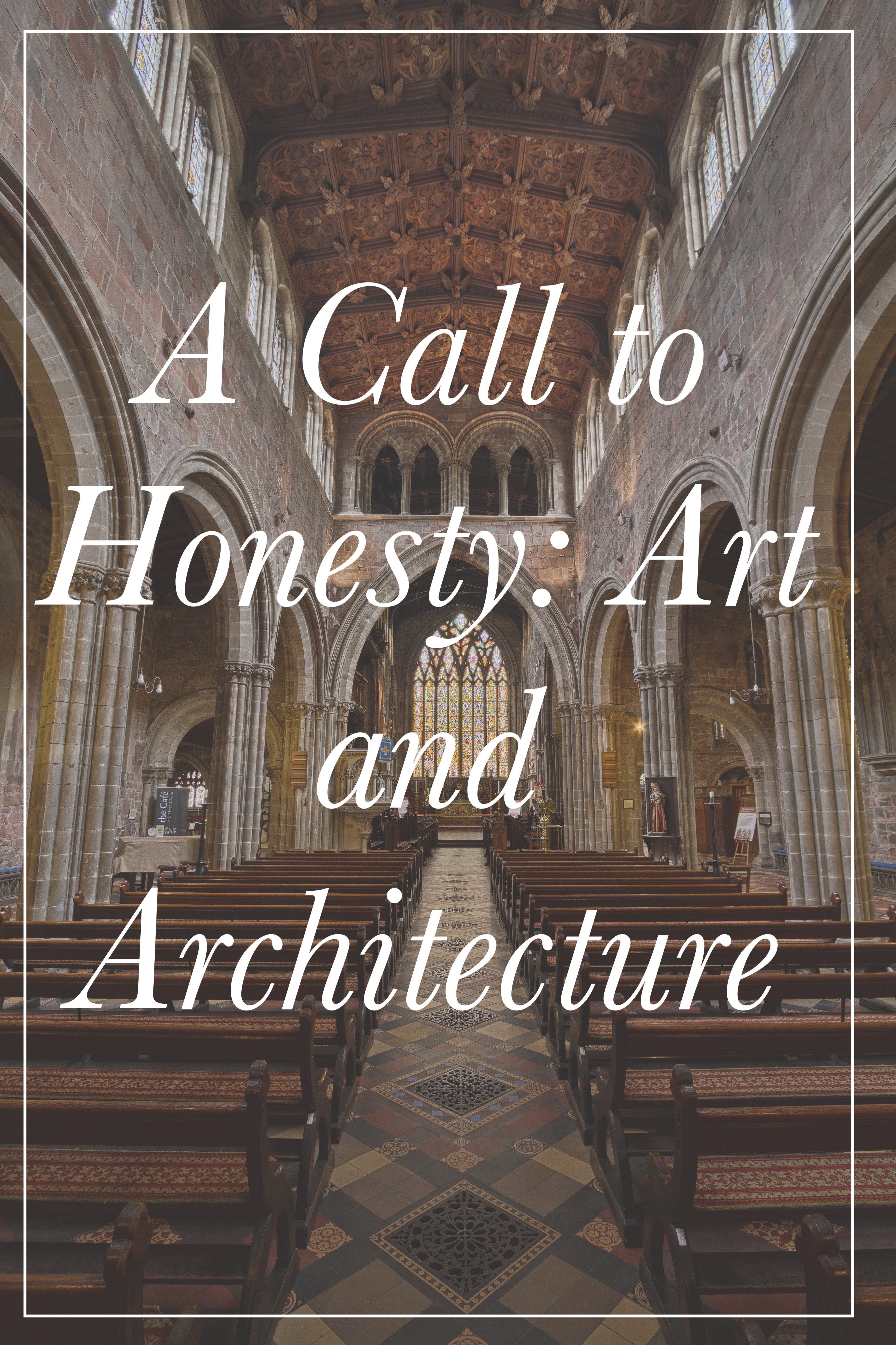
A Call to Honesty: Art and Architecture
“We’ve had enough exhortations to be silent. Cry out with a thousand tongues – I see the world is rotten because of silence.”
St. Catherine of Siena
I should begin this post by saying I am no art expert. I am just a girl who grew up in the 80’s and 90’s, subjected to the typically horrendous art, architecture and music that made its way into many Catholic Churches in those decades.
Even as a small child, I had a strong visceral reaction to it. I sensed there was something off, something discordant about it.
Then I went to Europe and was immersed in beautiful art and architecture — and I was surprised to encounter some of the greatest works of art known to man in the same places that I attended Mass.
For the first time in my life, I encountered art and architecture that wasn’t a distraction from the Mass. It actually enhanced my experience.
Who knew that was possible? It was eye opening.
A few months back I came upon this medallion in our Church. It was like I was back in the 1980’s again.
It was the Year of Mercy logo which had been displayed in Churches across the world in 2015.

So many questions came to mind.
Questions like: “Why is Jesus on skis?” and “Why is he donning a scarf that looks an awful lot like an emaciated man?”
Or even “Why does Jesus resemble a wrestler about to pull a Hulk Hogan and body slam that poor guy with only one good eye to the ground?”
I am absolutely willing to give the artist, a pass. I do not blame him for this atrocity.
Somebody actually approved this logo — likely an entire committee approved it — and did nobody suggested he pray and go back to the drawing board?
It’s hardly a representation of the Beauty of the Church, ever ancient, ever new.
Rather, it seems to speak of a group of men who haven’t been able to move beyond the 60’s, 70’s and 80’s — men who are stuck in the past, and not in a good way.
I am willing to admit that this might have to do with my own visceral responses to anything that resembles the awful art I was subjected to as a kid, but I sincerely believe that the art within our Church should transcend time and place.
The art and architecture contained within our churches should be universal.
It shouldn’t be an expression of the mind of the artist so much as an expression of the Mind of God.
There is a time and a place for artists displaying their abstract art, rich in personal meaning — but I believe that time and place is an exhibit at an art gallery.
It doesn’t belong in a church.
If somebody has to explain to me why a particularly awful piece is really a great work of art, and it belongs in a church — I will likely reply with a very simple answer.
Good art should speak for itself, it need not an explanation for it to be appreciated.
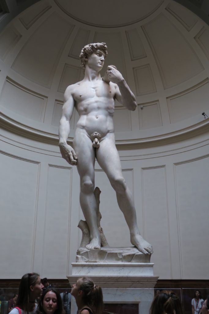
Sure, I appreciate Michelangelo more because I know about the story behind his pieces — but even if I didn’t hear one word of explanation, I’d still be floored by the David or when walking into the Sistine Chapel.
For me, that Year of Mercy Logo is a call to honesty.
It is a call to acknowledge that somewhere along the way, art and architecture began to lose it’s way in the Church.
It is a call to acknowledge that it’s not just art and architecture that lost it’s way — but theologians and teachers and even priests, who were supposed to lead us along the sure path of truth.
Is it a coincidence that the majority of the scandals that have been unearthed in recent months actually took place in the same decades that introduced some of the most awful art, architecture and music into our churches?
I think not.
I think there is a direct correlation between all the bad art of the 60’s – 90’s and the scandals and abuses that erupted in those times.
The bad art was a symptom of a problem within the Church. It was a signal that somewhere along the way people with authority in the Church had begun to lose their way.
Their theology was off — and their art exhibited that.
I’ve reached a point in my life where I believe we need to become more like children when it comes to calling a spade a spade, because kids are not afraid to be honest.
They aren’t mean. They just say the truth.
But us adults, we just smile and grit our teeth and we resolve to accept the status quo and not put up a fight for fear of offending.
In fact, I think every Church Reno committee should have a panel of kids who are given veto power when it comes to all the bad art these adults want to push on everybody else.

Let me give you an example of the brilliance of kids in action.
As a child I attended a horribly ugly church we often called “Holy Heresy”.
Yes, our nickname was irreverent, but it was our survival mechanism for dealing with all the heresy that spewed forth from the priest’s mouth on a weekly basis.
Eventually, our parents decided enough was enough and they moved us to a parish that rarely ever spewed heresy from the pulpit.
All was well — until, that is, a committee was formed to build a new church to house everybody.
They chose a well-known architect who didn’t understand Catholocism very well.
They also chose an artist to create metal monstrosities that were meant to represent the Hands of God (holding the tabernacle) and a very depressed Mary at Jesus’ side.
Let me tell you, the new Church was like a lifeless megachurch and the sculptures were just plain awful.
I can’t imagine having to stare at the depressed face of Mary or those creepy twisted hands that were meant to symbolize the hands of God every time I went to Mass!
Honestly, Mary looked like she needed a Prozac. She looked depressed and harsh and not at all what your momma should look like.
Here’s where the story gets good.
I happened to come back for the dedication Mass for the Church after it’s completion.
There Father stood, at the front of the Church — no doubt surrounded by many of the benefactors of the millions put into this new church building.
Father decided he would ask the kids at the Mass what they thought of “the wonderful new Church and the lovely statues”.
Big mistake.
One child raised his hand and said, “Mary looks scary” and then the little heads began to nod in agreement.
Another child a few rows over said, “Yeah. Mary looks very sad” and then all the little heads began to nod again and the hands began to pop up from all the kids ready to share their honest opinions.

Let’s just say Father quickly moved on to finish his homily — without anymore input from the kids.
Is that not hilariously amazing?!
I just wanted to run over and high five those kids. They said what many of us were thinking but would have been afraid to say.
The Bible says we need to become like little children to enter the kingdom of God. I think we all need to grow more like kids when it comes to speaking up in our Churches.
Because the sad reality is that we have given the next generation of kids an awful lot to fix — and I’m not just talking about bad art and architecture –they have inherited a much deeper spiritual problem that must be addressed as well.
I can’t help but think that as we fix the aesthetics that the poor formation problems will improve as well.
Can we please bring Jesus back to the center of our Churches? Can we give those who come into our Catholic Churches a foretaste of the beauty of Heaven?
And can we just burn the “Gather us in” “Sing a New Song” and the plethora of other awful hymns while we’re at it?!
Can we? Because I think we ought to try to repair our Churches so that they better represent their true identity.
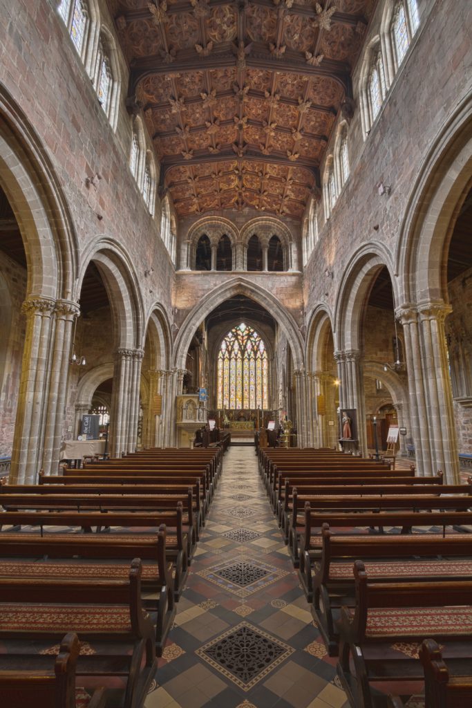
Churches are meant to be a gateway to Heaven. They are meant to reflect the beauty of Heaven.
They are the place where Heaven touches down upon Earth — where Beauty Itself is made fully present.
Can we please return our Churches to a truer reflection of that reality?
John Paul II famously wrote in his Letter to Artists:
“This world in which we live needs beauty in order not to sink into despair.”
John Paul II
He was absolutely right! He knew the world would grow dark and cold and dreary and we would need beauty in our churches to keep hope and optimism alive.
So that is my clarion call for us all today. Let’s bring beauty back to our churches in the form of art and architecture and music. Hooray!
Sharing over at Kelly’s


8 Comments
Paul
We seem to live in a society where tradition and appreciation of our ancestral backgrounds are sometimes shunned. What you have written is refreshing to read. We need to see “beauty” back into our Churches.
Moira
Thank you, Paul!
Julie
Amen cousin. The good, true, and beautiful should never be hidden and should be forever preserved. We have a number of newly built cathedrals here in the Atlanta area with beautiful architecture and statues- Saint Mother Teresa included and a stained glass window of St JPII. Our parishes are full and vibrant. I also agree that it’s time to kick contemporary trite music to the curb and keep Faith and Worship music outside the holy sacrament of the mass. Keep up the good work! I’ll send you a couple pics if I think of it.
Moira
Yes, do send pictures. I actually fondly remember the Cathedral when I lived in Atlanta (was it Christ the King, can’t remember). It had a cozy little adoration chapel and lovely architecture. Like you pointed out, so often those beautiful places coincide with a lively faith community that believes their churches are really their second homes — and worth making beautiful!
Lisa
Great post!!!
We had the opportunity to tour some of the beautiful old churches in Detroit when my kids were smaller – I remember my then 2 year old being transfixed by all the beauty there was to look at (a wonderful side benefit of all that visual imagery – having an unsquirmy 2 year old!!)
An elderly woman who was with us said that back then houses were plain and churches were beautiful.
They didn’t stint on the hymns either – the organs in those churches are amazing!!
Moira
Lisa,
Don’t get me started on the Church music in the 80’s 😂. Seriously that woman’s observation “back then houses were plain and churches were beautiful” is truly thought- provoking. Hmm… a bit of a gut check for where we are inclined to put our treasure !
Megan
Now you’ve got me humming “Sing a new song” in my head. Funny, I don’t remember any of the churches’ interiors from our childhood. I do remember the churches in Europe. Perhaps the good thing about the ugly churches is they are forgettable, but the bad thing is they are forgettable…I have a fever and I hope I’m making sense. Love ya, Megan
Moira
Ha! The other day I perused though some of the really bad hymns — you have to laugh or you would cry at the lyrics– oh my goodness many of them make absolutely zero sense. Did nobody think about what we were singing back then? Oh well, we survived. Glad you blocked it out. :). Yes, so true about the ugly churches being mostly forgettable — though for some reason they are forever ingrained in my memory. Love you, Meg!